CityTins’ mission is to encourage and incentivize community support of locally-owned and operated restaurants and businesses that contribute to the culture and community that make every city unique. Each CityTin holds coaster gift cards for locally-owned businesses; "tinners" love to use the coasters to drink and dine at new local restaurants.
(By the way, the gals who created CityTins are wonderful people and their tins are just plain cool. You should check them out.)
Objectives
The overarching goal for creating a CityTins mobile app: help tinners work through and utilize their Tin.
Our main strategies contributing to achievement of our goal:
- Provide a concierge for discovery of CityTin contents
- Assist tinners in navigation to the restaurant locations
- Support CityTins visibility on social media by integrating with Facebook, Twitter, and Instagram
Before developing a feature list, site map, or any designs, we focused on the functional outcomes of the app. By defining a clear audience and objectives, we were able to design and build to achieve those goals.
Design
Without explaining every single design decision made during our process, we'll highlight a few instances where we really had to put on our thinking caps to design with intention.
The invention of the "Tinventory"
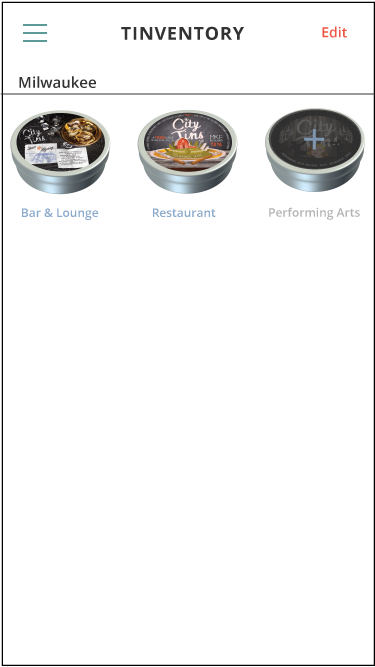
CityTins are a physical tin; they're beautifully designed and fun to sift through, and there's even a spinner for when you're feeling indecisive. Tinners can easily see which coasters are available by opening up their tin. We weren't trying to replace the tin. However, we wanted to provide a place where users could set up their account with the tins they own and quickly mark coasters as "used" or "available." Thus, the Tinventory was born: the home view of the app displays only the tins a user owns so they can navigate within the coasters available to them instead of sifting through all the restaurants in all CityTins.
This user has set up their Tinventory for their home city, Milwaukee, with two CityTins marked as available.
By viewing the contents of a tin, users can quickly see which coasters are used (greyed out) or available.
A sign in process with the end goal in mind
Our original sign in view prompted users to enter an email & password, with an "or" option of connecting via Facebook or Twitter. Seemed pretty standard...but wait! Why would we prioritize users to sign in with their email, when one of our main goals to easily connect tinners with social media? So, we flipped the layout and slimmed it down with the recognizable Twitter and Facebook icons. Immediately, the quick and easy sign in option is, obviously, to connect with Twitter or Facebook. (We also debated the merits of "Sign In" versus "Log In" and we might still be a team divided...)
The original sign in view. Okay, but not the best.
The current sign in view prioritizes signing in with social media.
Tracking Tinventory
Now this is getting into the tiny details. The feature seems easy enough: a user marks a coaster "used" or "available." Users can still see all coasters, even the used ones, so used coasters can't just disappear. For example, a user might redeem their coaster at a restaurant and mark it as used in the app; they still may use the app to navigate to that restaurant in the future or to see contact information or hours of operation. We brainstormed a whole host of ideas for marking a tin as used. We ended up sticking with our original idea, a simple one: a button that says either "Use" or "Restore."
When a user is viewing the details of a coaster in the app, they can mark it with the button "Use."
A bunch of ideas for the button in the top right corner of the coaster view.
Outcome
The CityTins mobile app achieves the main objective we laid out at the start of the project. With room for growth in additional features and integrations, we look forward to seeing how this app develops into the future! In the meantime, you'll find us tinning on Friday and Saturday nights. Find the app for iOS here.


